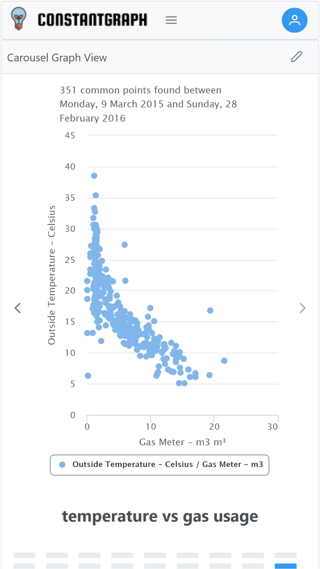
Channels can be compared across their entire history from Series Comparison on the Graphs menu. This is useful for finding correlations or relationships between different data sets. For example, how does my gas usage vary with outside temperature?
Select the first channel to compare from the channel menu on the left, then choose the aggregation period and aggregation formula. The None and Auto options are not available and the aggregation period are locked for both selected channels. This is to ensure that both channels are compared on the same basis. The axis name can be changed, of necessary; as the axis can be configured with minimum and maximum values it is also useful to get the correct scale on the scatter plot. A scatter plot will be shown across the X-axis only and the number of data points found.
Select the second channel to compare an XY scatter plot will be shown with all the common points found. Note that the number of common points may reduce depending on how many points are found that match in date and time. Depending on the data source selected, it's possible that there are no overlapping data points.
In the example shown, there is a strong correlation between the outside temperature and the gas energy usage below about 20°C above that temperature there is no correlation and the gas usage is constant regardless. This can be used to calculate the amount of gas that is used for heating versus the amount used for cooking and hot water.